|
Step 1: Select Quick Selection tool. Step 2: Make sure "Enhanced Edge" (top) is checked Step 3: Click "Select Subject." Step 4: Choose "Layer">"New">"Layer via Copy." Edit said Layer to commit to it. Step 5: Hide previous Layer to hide what wasn't selected by Quick Selection. Step 6: Choose "Layer">"Smart Objects">"Convert to Smart Object." Step 7: Choose "Layer">"Duplicate Layer" Step 8: Choose "Filter">"Blur">"Gaussian Blur..." Adjust slider as needed. Step 9: Click Blend Mode Menu (Normal), choose "Linear Dodge (Add)", Maybe change layer opacity. Step 10: Choose "Layer">"Duplicate Layer." Then double-click Gaussian Blur under the Smart Filters, adjust radius slider as needed. Do repeatedly until satisfied. Step 11: Click Create new Adjustment layer icon and choose Color Lookup. Step 12: (maybe) Click the 3DLUT File dropdown menu and select the Moonlight.3DL cube file. Select Blend Mode menu (Normal), select Screen. Change opacity. 
0 Comments
Step 1: Select Quick Selection tool. Step 2: Select object to change colour. Step 3: Click Create new fill. Choose hue/saturation. Step 4: Select Blending Mode menu, where it says "Normal." Choose colour. Done. 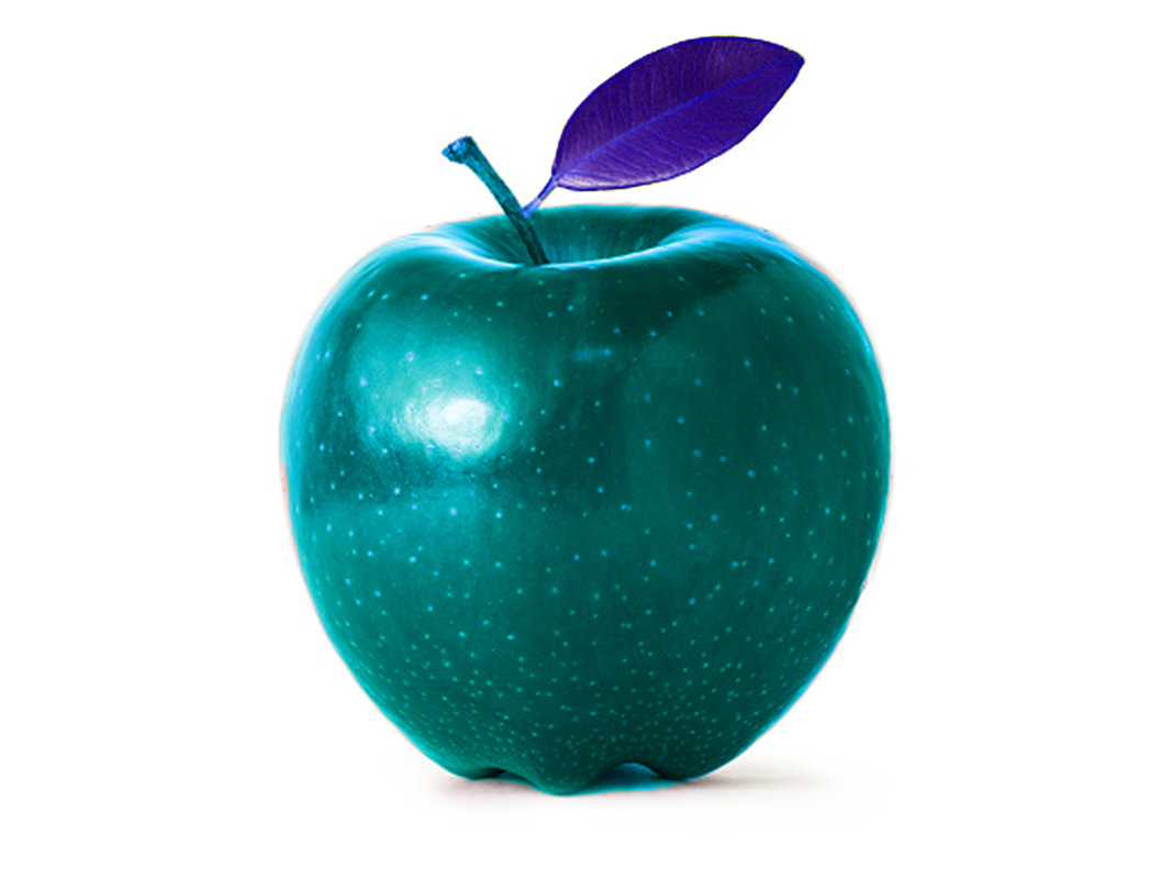 Step 1: Select Layer of image. Step 2: choose "Select">"Subject" to select the subject. Step 3: Click the Add layer mask icon (bottom right, "Japanese flag"). Step 4: Select new layer icon near add layer mask. Step 5: select Eyedropper or choose colour for background. Step 6: select "Edit">"Fill...", ensure contents is set to "Foreground colour", select transparency. Done. 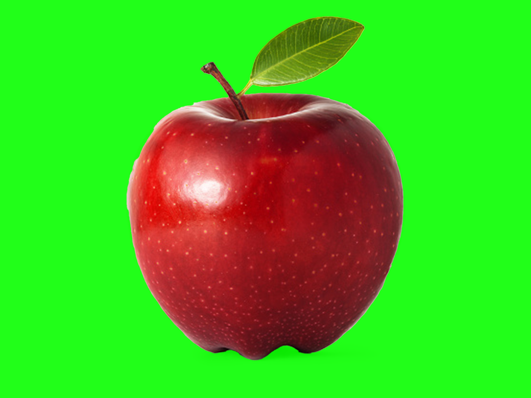 High contrast photograph  Low contrast photograph  An image of a painting with colors of highly contrasting values  An image of a painting with colors of similar value  A photograph in which the level of value contrast affects the mood of the image  A photograph in which the value contrast creates texture  A photograph in which the value contrast emphasizes the focus of the image  Value is the light/dark contrast in colours or hue between certain parts of an image. A higher value will mean more contrast, while a lower value can make certain parts blend together. Value can create a feeling of texture, mood, and atmosphere. it can make art pop or make it blend.
What? So What? Now What?
Consider the information you found in the assigned reading/video/activity. Answer the following questions to explain what important information you gathered from it.
1. Squash & Stretch: An object starts out as a simple shape, movement stretches it, impact squashes it. *Remember consistent mass!*
2. Anticipation: The build up for an action. Without anticipation, actions happen for no reason, objects appear from nowhere. 3. Staging: Includes setting, camera, acting/drama, pauses to allow processing of information, and most importantly, focus and timing. Allow one thing to happen, then move to the next action. 4. Straight ahead/pose to pose: Straight ahead is designing each frame in sequence, first, second, third etc. Pose to Pose starts with the main parts (beginning, middle, end), all the other animations in between. 5. Follow through/overlapping (drag): The momentum of an attached object connected to a moving base. 6. Slow in, Slow out: Start movement out slowly, gain speed, and close to the end slow down. 7. Arcs: A curve to add drama/realism to movements. 8. Secondary action: The minor details that further express a character and/or their mood. 9. Timing: Number of frames, the more frames, the slower the movement. Less frames make it go faster. 10. Exaggeration: Not O.T.T., but more emphasis on movements, more dramatic, more realistic movement. 11. Solid drawing: Adding 3D elements/shapes/lines to give depth. 12. Appeal: Is it interesting to look at? Visually pleasing/engaging? Unique designs, movements etc. Courtesy: AlanBeckerTutorials, Youtube. |
